

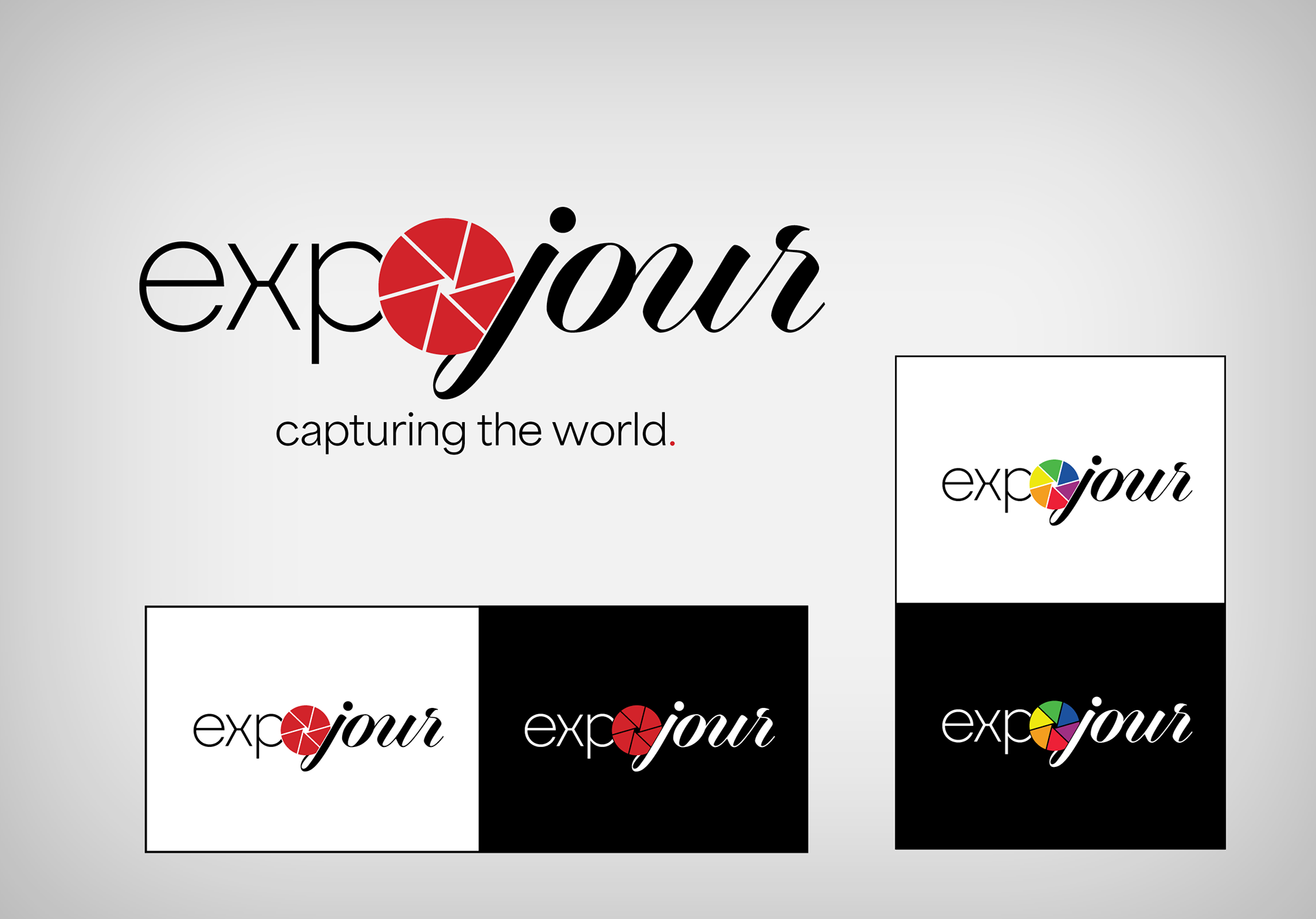
Expojour | Bebop Channel Corp.
When Madavor Media was purchased by the Bebop Channel Corporation, my attention was increasingly directed toward the launch of their future streaming TV initiatives. One of these was "Expojour"—a new channel intended to feature content centered around photography. I developed the logo below, taking care to ensure that different versions were made for use in a variety of situations.
⎯⎯⎯⎯⎯⎯⎯⎯⎯
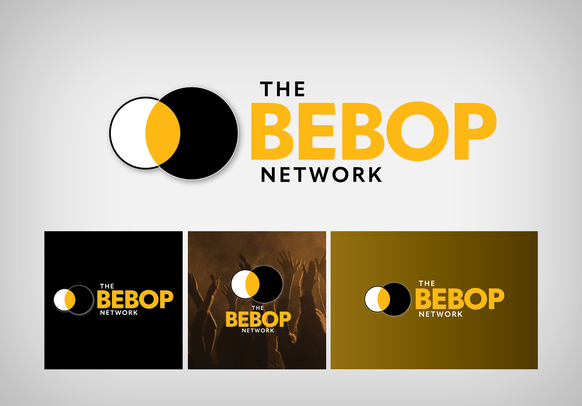
The Bebop Network | Bebop Channel Corp.
Along with the above logo identity for Expojour, Bebop also tasked me with designing the logo/identity of the newly launching "Bebop Network," which consisted of three new streaming channels packaged together: Expojour, Madavera, and JazzTimes Television.
Just as with Expojour, different arrangements were required so that the results would work well on all of the various platforms (web, iOS, Apple TV, Roku, Fire, etc.)
⎯⎯⎯⎯⎯⎯⎯⎯⎯
ADS – Audience Development Strategies
In 2012 Barb Dimauro, CEO and principal of ADS, commissioned me to develop the logo/identity for her company.

⎯⎯⎯⎯⎯⎯⎯⎯⎯
The Bergeron Group
Overall identity for a realty company in Connecticut. As it was a Keller Williams (KW) business, particular attention had to be paid to adhering to the KW franchise guidelines.
⎯⎯⎯⎯⎯⎯⎯⎯⎯
SLS — Student Leadership Symposium
Logo design developed for a UMass Dartmouth event.
⎯⎯⎯⎯⎯⎯⎯⎯⎯
The Torch — UMass Dartmouth Newspaper
Serving as design editor and later as managing editor, I led UMass Dartmouth's paper, The Torch, through two extensive redesigns during my tenure.
In my final year with the paper, I also spearheaded the launch of a supplemental publication, Firebrand. The flame icon from The Torch was retained for the logo/flag of Firebrand, as it was a central item in the identity for the paper overall.

⎯⎯⎯⎯⎯⎯⎯⎯⎯
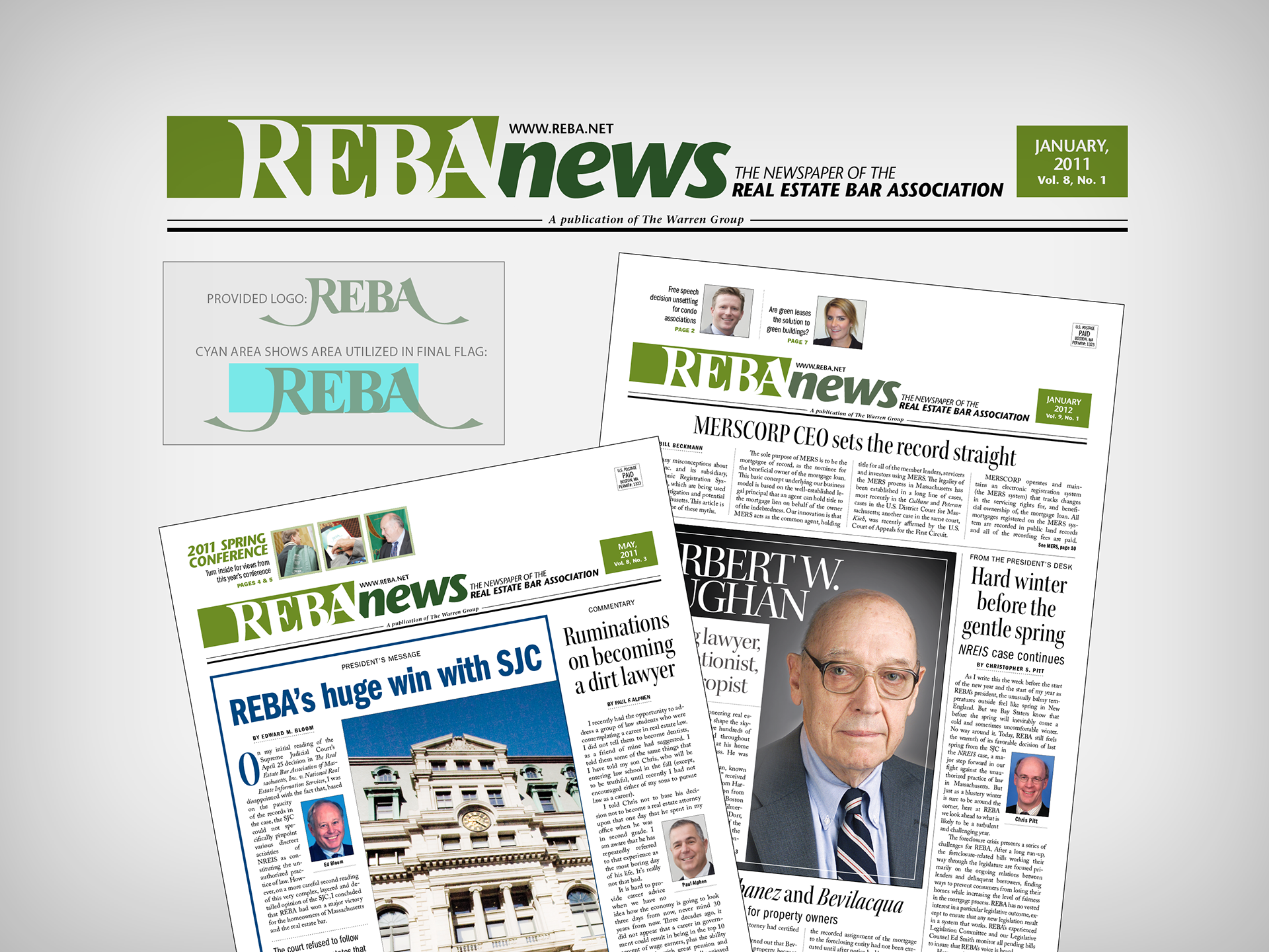
REBA News | REal Estate Bar Association
While working for The Warren Group (TWG), I was tasked with the redesign of the Real Estate Bar Association's official paper, REBA News, which at the time was entering into a new publishing agreement with TWG.
The organization wanted their REBA logo used in the flag/nameplate, but the tails coming off the R and A proved to be problematic. In the end, we arrived at the compromise shown below—the logo is present, but cropped to exclude the tails. The organization was very pleased with the results, continuing to use the design of REBA News for many years afterward.
⎯⎯⎯⎯⎯⎯⎯⎯⎯
The CRE Insider | Banker & Tradesman
While serving as a designer for The Warren Group, it was decided to rebrand their commercial real estate section (formerly Commercial Real Estate Monthly). I was tasked with the redesign of the section, which was to be known going forward as "The CRE Insider."